Halftones & Tinted Halftones
One of the main methods of printing postcards was through the use of halftones, which are essentially gradients made up of small dots (or other shapes). At a good magnification, human eyes can see the individual dots (as pictured on the right), but from farther away, the dots blend together and our eyes perceive an image. Postcards printers typically used a black halftone as the base. This black halftone was also known as a key plate, and it was derived from a photograph.1
Some halftone postcards were hand-colored by artists employed at postcard production facilities, but other postcards, known as tinted halftones, were colored using a more mechanized process very similar to that of halftones.
To color halftones, printers would add extra plates—typically red, yellow, and blue (RYB) or red, green, and blue (RGB). These colors were added to applicable areas with dots or spatter, and in many cases, these additional color plates were also halftones.2
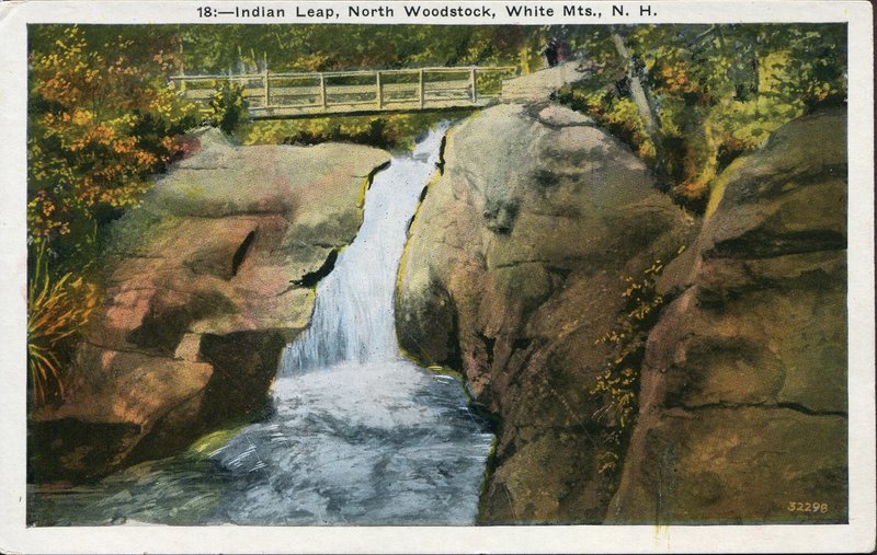
Even without close examination, the postcard below shows evidence of RYB plates: there are large swaths of red on the rocks, yellow in the foliage, and blue in the water.
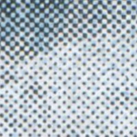
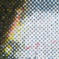
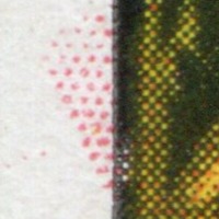
A closer examination of the postcard shows that it was indeed created using a black halftone plate—note the different sizes of the black dots in the close-up (Fig. 1), where the larger dots represent a darker area, and the smaller dots represent a lighter area. This close-up examination also clearly shows the evidence of red, yellow, and blue plates that have combined with the black halftone to create the image on the postcard (Fig. 2). On the left border of the postcard, we can even see the red plate printed a little bit outside the desired image area (Fig. 3).
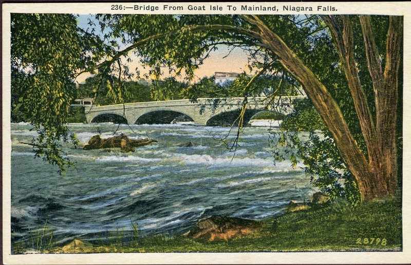
While the Indian Leap postcard is an excellent example of an identifiable tinted halftone, it is also an excellent example of poor color mixing, as evidenced by the visible swaths of individual colors. More careful coloring and laying of plates resulted in better color mixing, such as that shown in the postcard below. Like the Indian Leap postcard, the Bridge from Goat Isle card is a tinted halftone with RYB plates, but the colors are more realistic, particularly the greens of the grass and trees.
With continued advances in printing technology and better understandings of color mixing and theory, the images on postcards continued to improve into the 1930s with process printing.
Footnotes
- Alan Petrulis, "Halftones and Hybrids: Halftone," MetroPostcard.com, http://www.metropostcard.com/tech3-halftone.html (accessed August 29, 2018).
- Petrulis, "Halftones and Hybrids: Lithographic & Line Block Hybrids," MetroPostcard.com, http://www.metropostcard.com/tech3-hybrids1.html (accessed August 29, 2018).
